
Sansiri Home Service App
A full research and analysis sprint to diagnose the current resident experience and define a clear direction for improvement — before committing to design or development.
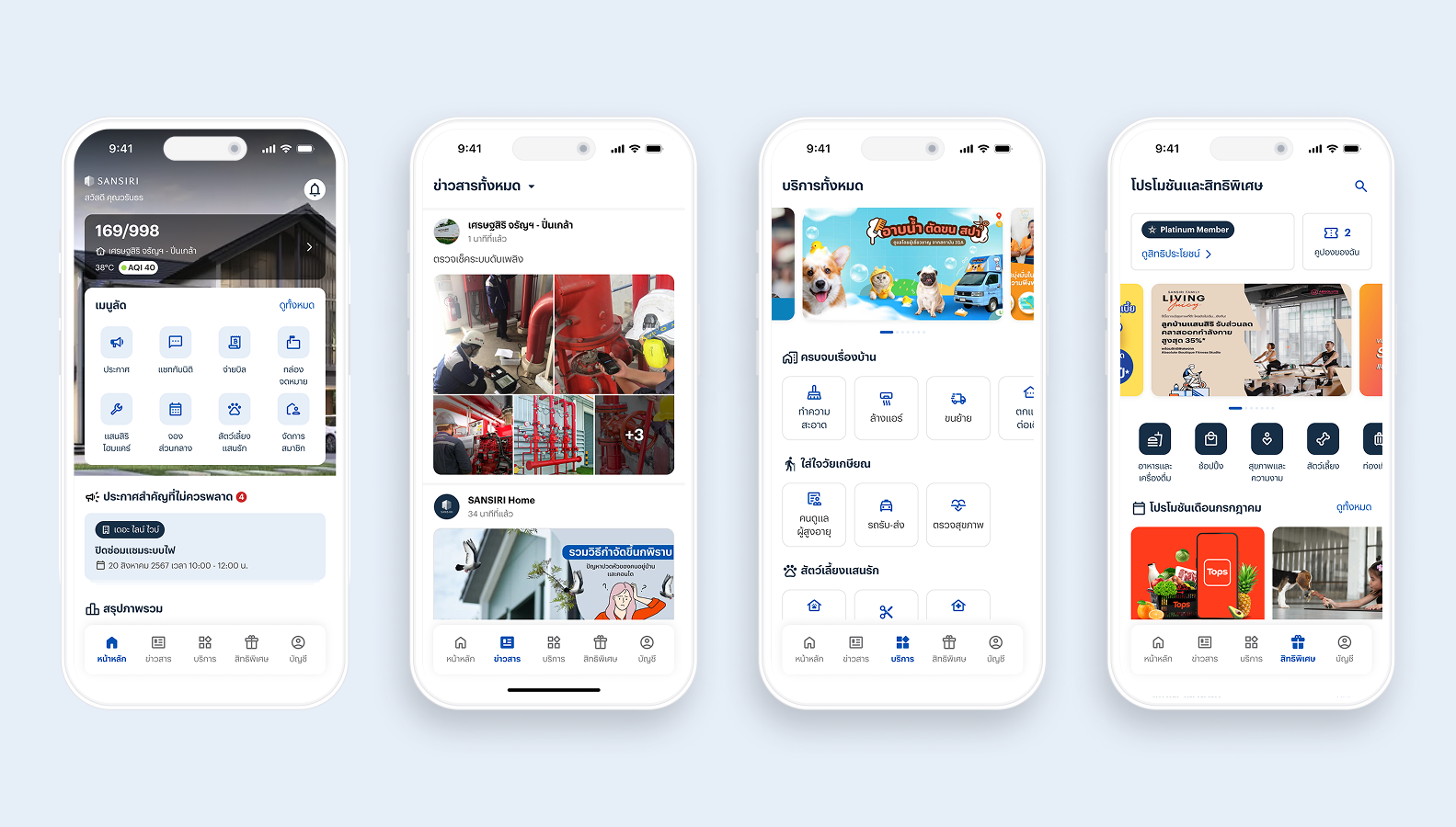
Overview
Sansiri is one of Thailand's leading property developers, managing residential communities across two housing types. To serve these residents, they operate two mobile apps: Sansiri Home for landed property residents, and Plus+ for condominium residents under Sansiri's juristic team.
Despite a growing list of features — bill payment, announcements, home services, parcel tracking — neither app felt like something residents reached for out of habit. Engagement was low, and the gap between what the apps offered and what residents actually needed had quietly widened over time.
I was brought in through KO-Experience to lead Phase 1: a full research and analysis sprint to diagnose the current experience and define a clear direction for improvement.
Background
Where Sansiri stood before the research began.
Before any research began, I audited both apps against 10 local residential apps across 12 feature dimensions — to establish where Sansiri stood relative to the market before talking to users.
The project began with Phase 0 — a design strategy sprint to define product direction. Three design principles framed every subsequent decision:
Concise — Clear, accessible, easy to reach. Every interaction should reduce cognitive load, not add to it.
Communicative — On-point delivery of brand values and relevant content — no noise.
Consistency — Coherent and systematic across the product. Residents should never re-learn a pattern.
Competitor feature audit
Sansiri was benchmarked against 10 local residential apps, identifying gaps in onboarding, guest access, and service discoverability.
Sansiri (highlighted) trailed the market on onboarding and access basics — onboarding tutorials, social login, OTP confirmation, and open guest access were missing or incomplete. This shaped the focus of the research.
Spotlighted competitors
RueJai App (SC Asset) — Announcement classification. Separates urgent notices from general news with clear hierarchy. This model directly informed Sansiri's revised announcement architecture. Caution: categories must be applied consistently.
Supalai SABAI — Service discoverability. Groups services by usage behaviour rather than department. Caution: usage-based groupings need regular updating as behaviour drifts.
The process
Three complementary methods, each answering a different question.
In-depth Interviews
To understand lived experience, mental models, and latent frustrations. Six participants across four segments: landed residents, high-rise residents, pet owners, and residents with elderly family. The mix was deliberate — Sansiri's base is not homogeneous.
Concept & Usability Testing
Via Maze, to validate proposed directions against real interaction behaviour rather than what participants said they would do.
Competitor Analysis
To benchmark against local residential apps and global service platforms — Angi and Airbnb as reference points for onboarding and service discovery.
Understanding the problem
How might we make the Sansiri resident experience feel like a genuine part of daily life — not just a utility for paying bills?
Interview conversations were structured around four hypothesis areas from the initial audit. Each was assessed against four enhancement pillars: User Experience, User Interface, Information Architecture, and User Journey.
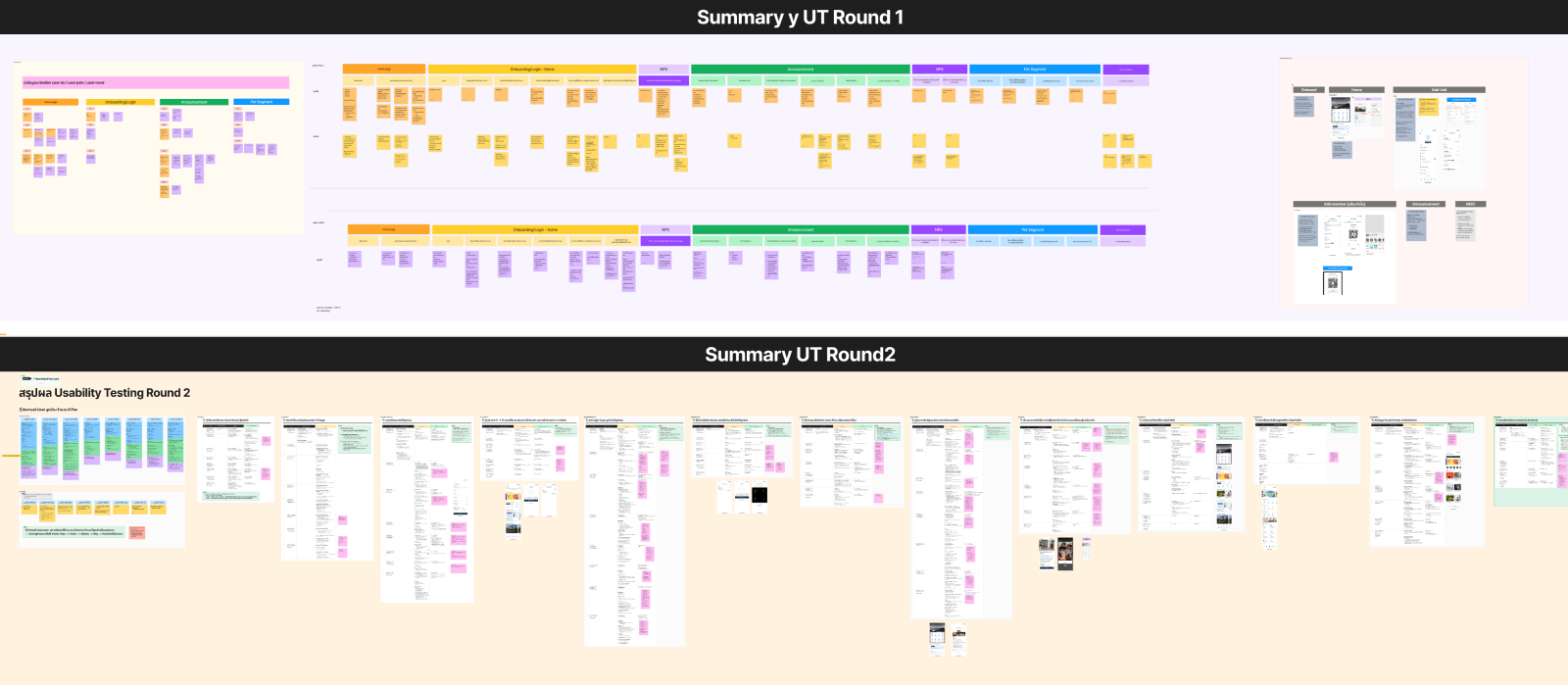
Participant groups
Four segments, deliberately chosen — 7 in Round 1, 8 in Round 2.
The Busy Professional — Landed & High-rise. Comfortable with technology, time-constrained, prioritises security and clear notifications. Goal: quickly manage property info without friction.
Active Community Member — High-rise (Plus+). Engaged with community news; frustrated when notices are buried. Goal: stay reliably informed about their building.
Pet Owner — Landed & High-rise. Wants grooming, vaccination, and pet-care services; interested in community pet tracking. Goal: access pet services without leaving the app.
Resident with Elderly Family — Landed. Caregiver with the highest bar for trust — requires visible reviews and credentials. Goal: find reliable, credentialed, clearly-priced care.
Gathering insights
What residents actually experienced.
Home screen. The most friction of any surface. Menu organisation felt arbitrary — residents navigated by muscle memory. Bottom-nav icons were unrecognisable without labels; promotions sat below the fold. Notably, multi-property owners navigated by memorising each unit's photo — and the property switcher was invisible to 5 of 6 participants.
Announcements & notifications. Both housing types shared the same frustration: urgent notices were indistinguishable from general updates. Notifications arrived in mixed languages, with no timestamps, and read/unread was communicated by colour alone.
Onboarding & guest mode. Adding a second resident required manual processing through the juristic office. Guest Mode was broadly misunderstood — participants assumed the properties shown were for sale.
Home services — pet & aging. Pet owners wanted to locate grooming, book vaccinations, and track stray pets. For elderly residents and caregivers, trust was central: any home health service required visible reviews and clear credentials.
Prioritisation
Anchoring findings to numbers.
CSAT scores were collected at the close of each interview to establish a measurable baseline and identify where improvement would have the greatest impact.
NPS was measured twice — against the existing experience, and again after concept testing:
Concept & usability testing
Five scenarios, tested against real behaviour via Maze.
Guest Mode. Participants couldn't identify the purpose; all assumed properties were for sale. A pre-entry popup explaining the mode was consistently requested.
Home — property switcher. Only 1 of 6 switched property without prompting. The carousel indicator overlapped the shortcut menu; participants expected the switcher near the logo or profile.
Shortcut menu customisation. Participants strongly wanted to arrange their own menu. The default felt arbitrary, and customisation risked duplication with the default set.
Announcements — general & urgent. All located an urgent notice when pinned to the first scroll; zero found it in secondary positions. Critical notices must be persistent, prominent, and non-dismissible.
Service shelf — pet & aging. Proposed services were well received. Pet owners wanted community-wide tracking; elderly caregivers wanted home-visit services with trust signals.
Round 2 — measurement
Validating the design against real behaviour.
A second round of 8 in-depth interviews and on-site usability tests measured whether the proposed directions actually performed. Where Round 1 understood the present experience, Round 2 introduced the revised concepts and measured responses directly.
The NPS jump from 17 to 67 — crossing the "Excellent" threshold of 50 — gave Sansiri a data-backed signal before committing to full design and development.
Recommendations
A prioritised backlog, structured by feature area.
Home. Sort shortcuts by frequency. Allow customisation with safeguards against duplication. Label all bottom-nav icons. Surface AQI / PM2.5 with push notifications.
Announcements. Classify into urgent / project / general. Pin critical notices to first scroll. Make urgent announcements non-dismissible.
Notifications. Add timestamps, language separation, and property labels. Replace colour-only read/unread with a clear visual system.
Onboarding. Let owners add residents and assign roles independently. Add a Guest Mode explainer before entry. Introduce a 'save project' feature.
Services. Launch a focused Pet MVP before expanding. Elderly-care services must lead with trust signals — reviews, credentials, transparent pricing.
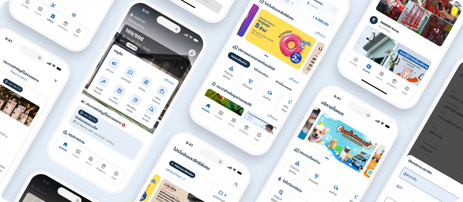
Design evolution
From nodes to user interface.
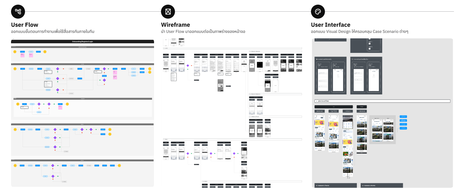
User Flow
Mapped task sequences and decision points for each feature area — aligning the team on interaction logic before screen design.
Wireframe
Translated flows into low-fidelity layouts, establishing hierarchy and component placement across all key journeys.
User Interface
Applied visual design across all case scenarios — covering the full range of user types, states, and edge cases.
Outcome
NPS went from 17% to 67% after concept testing.
Concept testing confirmed the proposed directions before Sansiri committed to full design and development. A 50-point NPS lift gave the team confidence to move forward, with measurable targets already set for Phase 2.
Deliverables: Research report · Prioritised backlog · Revised IA · Product & Design Principles · Sample UI directions
Takeaways
What I'd carry into the next project.
Both housing types shared more than they differed.
Landed and high-rise residents described near-identical frustrations despite using separate apps — opening the door to a unified design approach.
Metrics made prioritisation a data conversation, not an opinion.
Anchoring recommendations to CSAT and NPS grounded decisions in evidence and gave product and engineering a shared language for trade-offs.
Business-goal features still need to make sense on first encounter.
Guest Mode aimed to expand reach but assumed users would understand a concept with no real-world equivalent. The user's mental model is the starting point.