
Redesigning IPD Order Summary
A full-loop research and design sprint to improve a critical clinical tool used daily by nurses, physicians, and pharmacists. The goal: reduce confusion, prevent errors, and make the system feel trustworthy under pressure.
Overview
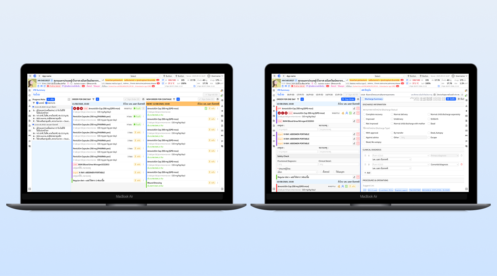
HIS (Hospital Information System) is the core platform used by clinical staff across every department. At the centre of daily IPD (In-Patient Department) workflow is the Order Summary screen, where physicians write orders for medications, labs, imaging, and procedures, and where nurses track, acknowledge, and execute those orders in real time.
The existing screen had accumulated years of complexity without a structured design pass. Clinical staff had developed workarounds: paper notes during ward rounds, verbal handovers for information the system couldn't surface. The cognitive load of parsing a cluttered interface had become a daily source of friction and error risk.
As the sole Product Designer, I led everything — planning the process, conducting interviews, facilitating the Design Sprint, building wireframes, and running two rounds of validation. The goal was a measurably better system backed by real user data, not design instinct.
Context
What the screen is, and why it matters.
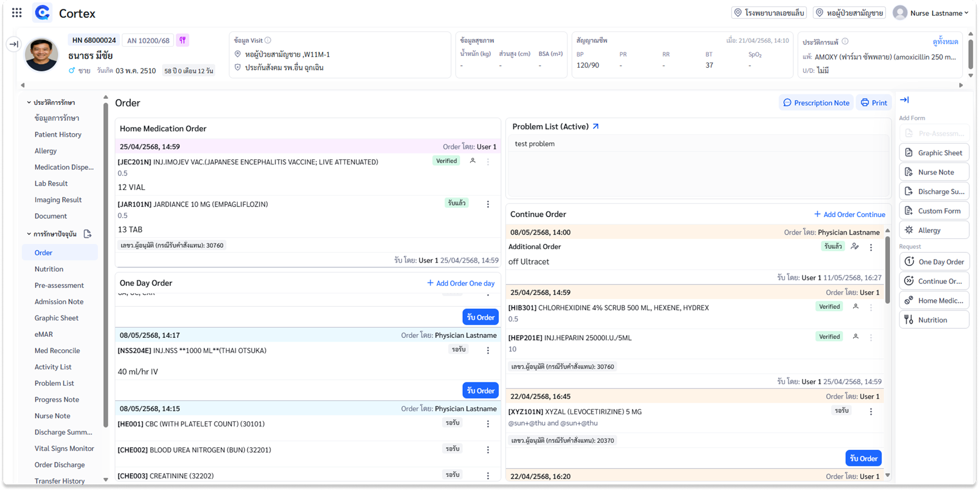
The IPD Order Summary is the single screen where all treatment decisions for a hospitalised patient are recorded, tracked, and acted upon. Physicians write orders; nurses acknowledge and carry them out; pharmacists verify drug orders before dispensing. Every clinical role depends on this screen every day.
Three distinct user groups with three different information needs share one screen — and in its existing state it was failing all three. Orders were mixed together with no hierarchy. Active and stopped orders were visually indistinguishable. Search required exact text matches.
At ICU level, where medications are high-risk and timing is critical, the consequences of a missed or misread order are serious. The cost of an unclear interface is not inconvenience — it is patient safety risk.
User roles
Physician. Writes and reviews orders during ward rounds. Needs to see at a glance what is active, stopped, or not yet received — without leaving the screen.
Nurse. Acknowledges and executes orders across many patients per shift. Needs clear status signals, separation by type, and a reliable handover view.
Pharmacist. Verifies drug orders before dispensing. Needs legible dosing, clear active vs. off status, and no ambiguity.
Process
A full-loop process planned from day one. Nothing skipped — the clinical context required evidence at every step.
Research & As-Is Analysis
Mapped the existing screen against Nielsen's 10 Heuristics. Identified structural problems across visibility, error prevention, and information architecture.
User Interview & Scoring
In-depth sessions with 5 nurses and 3 physicians. Structured themes: task flows, ward-round behaviour, handover pain points, error stories. Scored the existing system with CSAT.
Design Sprint Workshop
Time-boxed sprint with 9 participants across roles, stakeholders, and dev. Collaborative ideation using the Kano Model to prioritise.
Wireframe & Validate
Wireframes built from sprint output. A second round of testing scored the concept on CSAT and SUS, iterating before sign-off.
Nielsen's 10 Heuristics gave a structured lens for auditing the existing screen; the Kano Model separated what must be fixed (Basic) from what adds value (Performance) and what would delight (Excitement) — keeping the sprint focused on impact, not scope.
Understanding the problem
Six critical failure points in the existing screen.
No separation between active and stopped orders. Displayed together with no visual distinction — staff had to read each one to determine its status.
No grouping by order type. Medications, labs, imaging, and activity orders all in one undifferentiated list, with no way to filter or isolate by type.
No real-time order status. No indication of whether a nurse had acknowledged an order. Paper-handover orders weren't reflected in real time.
Search required exact full-text match. Standard abbreviations like CXR (Chest X-Ray) returned nothing. No autocomplete, no memory of past searches.
Progress notes disconnected from orders. Staff couldn't view orders alongside clinical notes — ward rounds required paper; handovers were done verbally.
Off orders vanished or became invisible. When stopped, an order disappeared or became unfindable — yet staff wanted them visible as a safety reference.
User interview
5 sessions across nurses, physicians, and pharmacists.
I conducted 5 in-depth sessions with 5 nurses and 3 physicians, using a structured guide covering task flows, ward-round behaviour, order-management pain points, and handover challenges. Each session ended with a CSAT rating. The interviews surfaced behaviour, not just opinion — I observed how staff scanned the screen, when they reached for paper, what they did when they couldn't find something.
ไม่รู้ว่าอันไหนยังออนอยู่ อันไหนออฟแล้ว โดยเฉพาะถ้า order เยอะ
"I can't tell which orders are still active and which are stopped, especially when there are a lot."
— Nurse
ตอนทำ ward round ไม่มีคอม ต้องจดก่อน แล้วกลับมาคุยอีกครั้ง
"During ward rounds I don't have a computer, so I write things on paper first and re-enter them later."
— Physician (Resident)
off order มองไม่เห็น หาไม่เจอ อยากให้สีแดง เพราะอาจจะหลุดได้
"Stopped orders are invisible. I want them in red — a medication that slips through unnoticed is dangerous."
— Nurse
Search บางทีต้องพิมพ์ชื่อเต็มถึงจะมีข้อมูล อยากพิมพ์ย่อๆ เช่น CXR
"Search sometimes requires the full name to find anything. I just want to type the abbreviation like CXR."
— Physician (Attending)
Themes from the data
Order visibility — can't distinguish active from stopped; off orders disappear. Information overload — all types mixed, no grouping. Workflow duplication — paper notes, verbal handovers, re-entering orders. Real-time gap — no confirmation orders were received. Search friction — exact-match only. Handover failure — not enough context in one view.
Baseline
Scored below threshold on both usability measures.
At the end of each interview, participants rated the existing screen with two standardised tools: CSAT for satisfaction and SUS for usability — giving a quantitative baseline, not just a list of complaints.
Both scores below their thresholds confirmed what users described: functional enough to use, but creating constant friction, requiring workarounds, and not trusted the way a clinical tool must be. They gave the sprint a clear, shared target to design against.
Design Sprint
9 participants, one session, structured convergence.
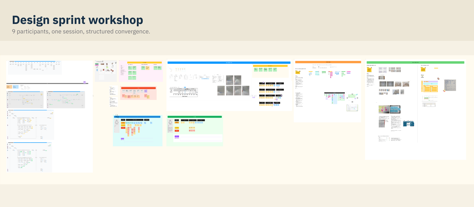
I facilitated a Design Sprint with 9 participants: nurses, physicians, pharmacists, stakeholders, and the dev team. Bringing every role into the room with clinical staff as the primary voice was deliberate — the problems came from silos, so the solutions needed cross-role alignment.
Kano Model — what to build, in what order
Key decisions from the sprint
Individual acknowledgement only, no batch receive. 6/6 nurses rejected a "receive all" button — the fear of acknowledging a wrong order outweighed the convenience.
Off orders stay visible but clearly marked. 4/6 preferred strikethrough text, a red date stamp, and grey background — the order is a clinical reference.
By-day display with dividers. All 3 physicians wanted orders organised by day, consistent with how they review treatment on paper.
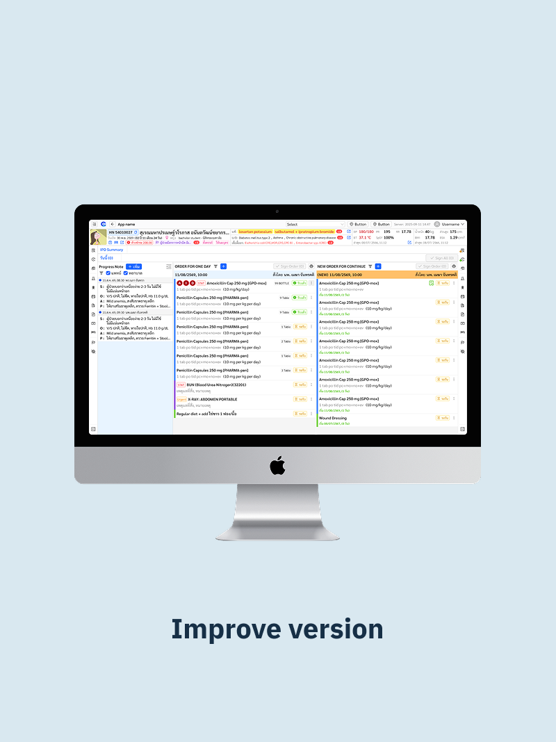
Colour coding by type. Blue medications, green activity, purple investigations, red OFF, grey free text — as subtle left-border accents.
Key insights
Five design directions from research to solution.
Make order status legible without reading
Active vs. off must be distinguishable at a glance through strikethrough, colour, and weight — so staff can scan under time pressure without misreading status.
Separate orders by type, always
Medications, Lab, Imaging, and Activity as distinct, independently reviewable groups — reducing the time any role needs to verify their domain.
Off orders: visible, unmistakable, not deleted
A stopped order stays as a clinical reference, marked with strikethrough and a stop date, de-emphasised enough not to interfere with active scanning.
Progress note and orders in one view
Clinical notes beside orders, no screen switching — eliminating the most common reason for paper note-taking during rounds.
Smarter input and real-time status
Search with autocomplete and abbreviations; surface when an order hasn't been acknowledged — cutting the main sources of duplication.
Design solution
Wireframes built from research, not assumption.
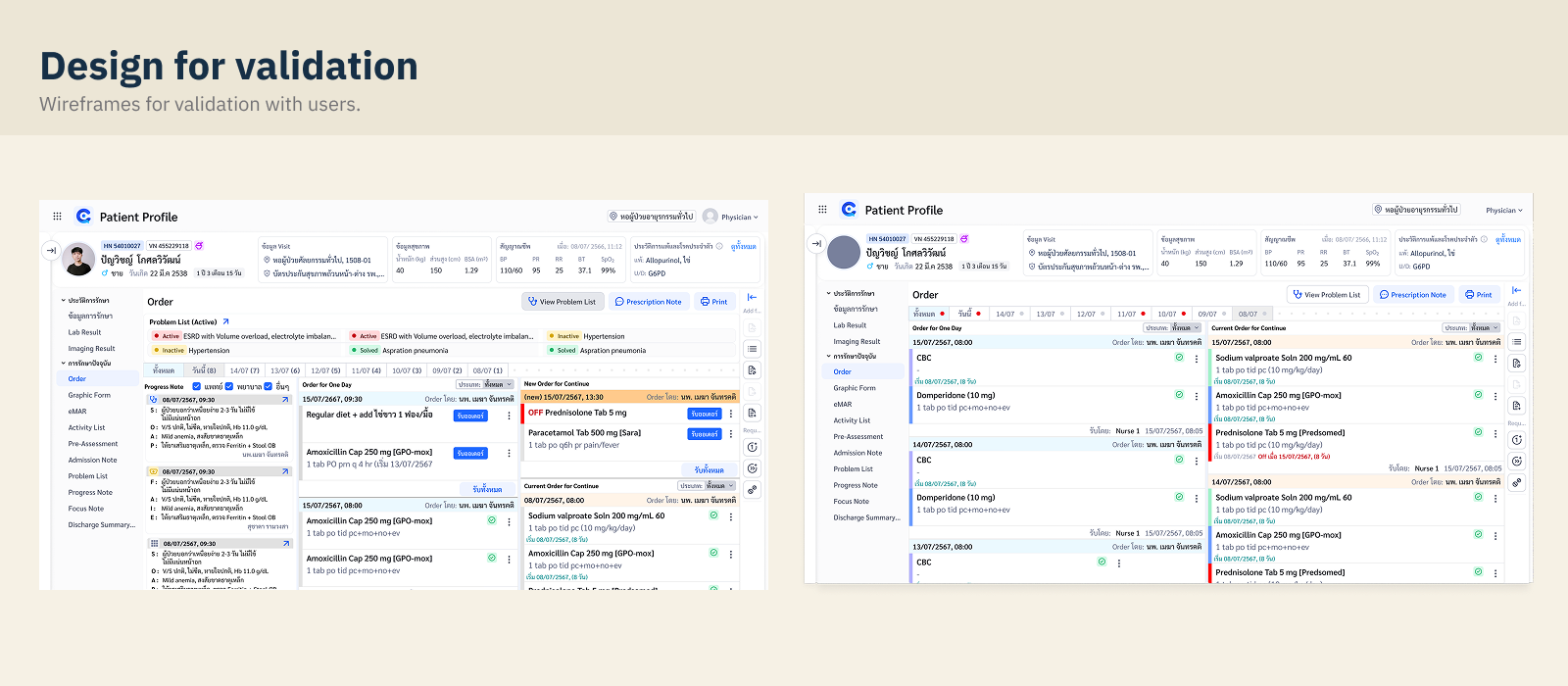
Every structural decision traced to a specific finding. The redesign is built around three principles: legibility first (every status readable without interpretation), separation by type (Lab, Med, Imaging, Activity as distinct panels), and trust through visibility (stopped orders stay in view, real-time status always surfaced).
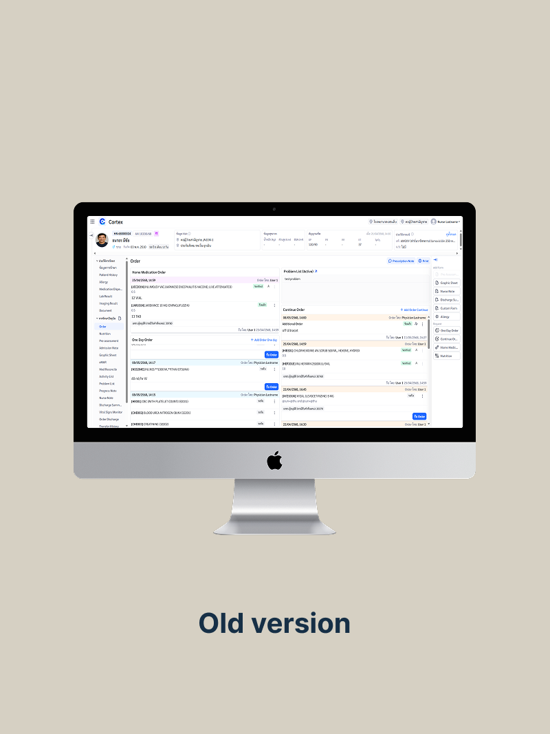
Before & after
The same workflow — reviewing all orders at shift start.
Same data, same clinical scenario, different cognitive experience. The comparison shows the existing screen and the redesigned concept at the same point in a nurse's workflow.
Final UI
The validated concept, ready for handoff.
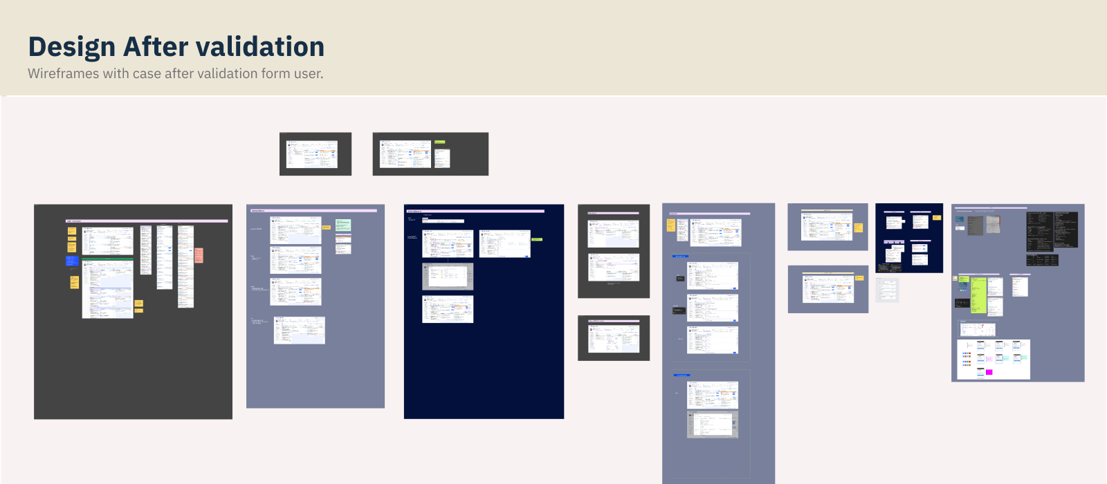
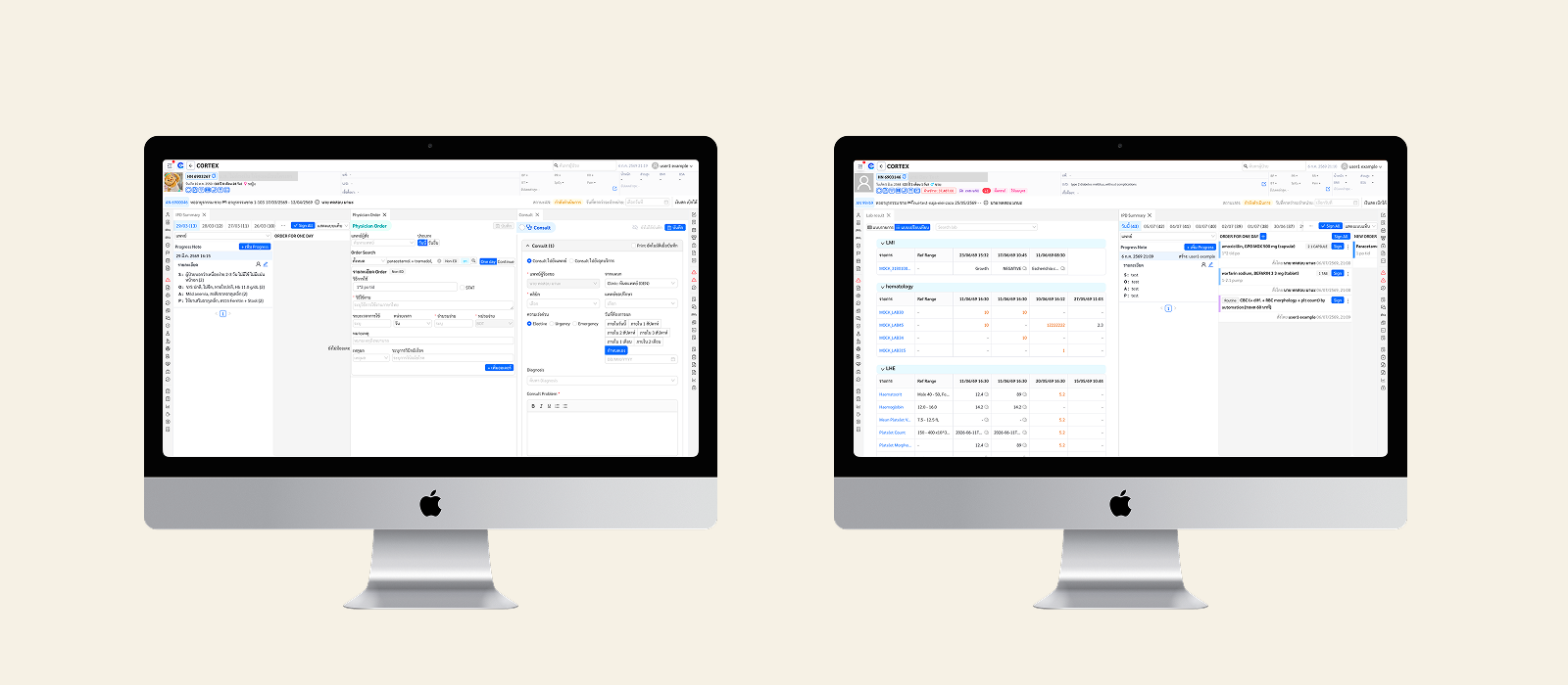
After two rounds of iteration informed by clinical feedback, the final concept was validated and presented for stakeholder review. Every screen was annotated with interaction logic, UX rationale, and edge-case handling for the dev team.
Validation
Testing the concept with the same users on the same screen.
I ran a second round with the same clinical staff, working through the same scenarios: reviewing orders at shift start, locating a stopped medication, checking whether a lab order had been acknowledged, and doing a handover. I scored with the same CSAT methodology, then applied SUS.
สะดวกมากเลย! แยกออกมาแบบนี้ดีกว่าเดิมมาก
"Wow, this is so much more convenient. Separating them like this is so much better than before."
— Nurse, 2nd validation session
Outcome
CSAT rose from 20% to 80%, with a unanimous "Excellent" rating.
The redesigned concept was validated across two rounds of testing, with a SUS score that moved from "Poor" into the passing range. Every screen was annotated with interaction logic and edge-case notes for the dev team.
Deliverables: Main order view · Order-type panels (Med/Lab/Imaging/Activity/Free text) · Lab & Imaging results · Off-order states · Progress-note integration · Problem list · Annotated dev handoff
Takeaways
Designing for specialist users under pressure.
Trustworthy is not the same as clean.
Clinical staff are expert users with low tolerance for ambiguity — in ICU, an unclear interface is a risk. Designing for them meant following what trustworthy means to someone making safety decisions for 12 hours straight.
Metrics as a design tool, not just a success measure.
Scoring the existing system before designing anything gave a shared, objective picture of the problem. CSAT 20% → 80% is a story everyone understands.
The Kano Model keeps sprint focus where it matters.
With many possible improvements and limited dev capacity, separating Basic from Performance and Excitement gave a clear rationale for what to build first.